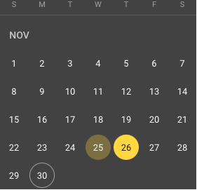
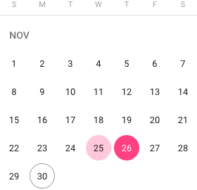
fix(material/datepicker): adjust focused date background for better visibility - #21176
Conversation


 google-cla
Bot
added
the
cla: yes
annieyw
added
Accessibility
google-cla
Bot
added
the
cla: yes
annieyw
added
Accessibility

|
What are the contrast ratios on the text with the new treatment? |

|
5 for dark mode and 11.73 for light mode |

|
What about just using a darker gray? In my mind the color is kind of associated with being selected. I'm also curious what this would look like on a date-range picker, where I think dates in between the 2 selected end points are a similar color to what you used here |
|
This is what it looks like with the range, I think it still looks fine, what do you think? |
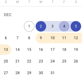
|
Ah I scanned the spec but didn't notice that. In that case yeah, lets go with the color |
|
For reference, here's what it looks like when overlapping the green and yellow: It's not my favorite, but good enough |
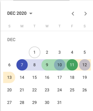


|
Looking through the designs in the spec (https://material.io/components/date-pickers#desktop-pickers), it seems like the circle is supposed to be transparent with an outline when selecting a range. It may end up complicating the selectors though.
A bit further down there's a graphic that says not to use the same colors for selected and hover.
|
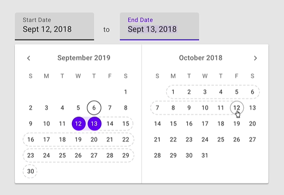
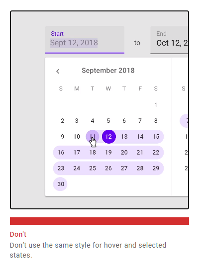
|
For the part where it says not to use the same style for hover and selected states I think it refers to selected range vs to be selected range. However it does seem like the datepicker and date range picker have slightly different hover state treatments. |
|
Confirmed with MDC designer that hover over selected range should be same as normal datepicker |
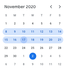


|
This issue has been automatically locked due to inactivity. Read more about our automatic conversation locking policy. This action has been performed automatically by a bot. |

4 participants


Fixes: #18845
Before:
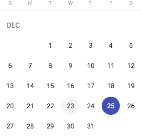
After: